‘Toledo brand’ scraps ‘TR’ logo
City’s new message includes name; introduces actual campaign slogan
4/5/2014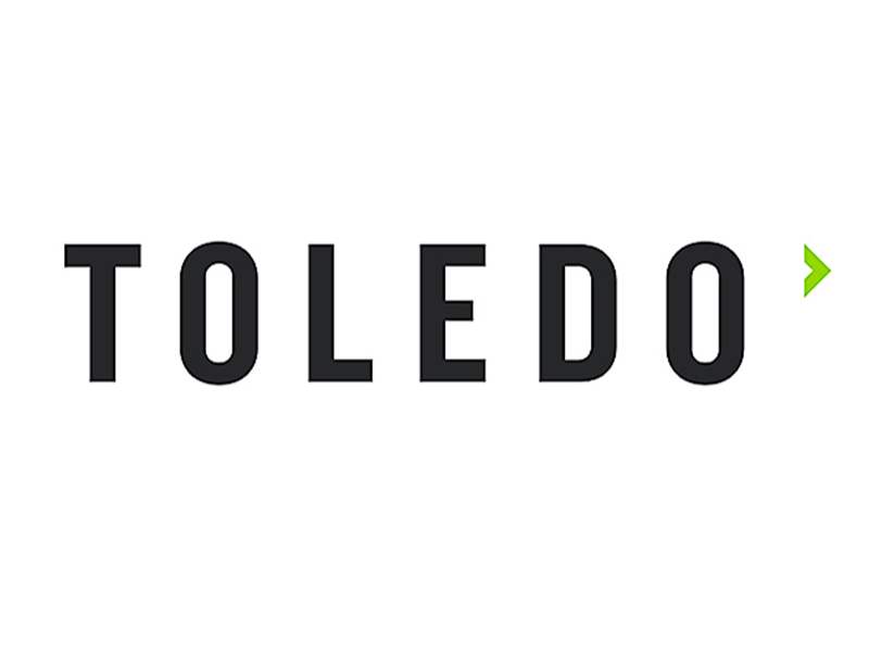
New logo.

Toledo Region branding initiative example.

New logo.
The nearly five-year effort to develop and promote a “Toledo brand” has gone back to the drawing board — figuratively and literally.
The group leading the effort on Friday debuted a revamped identity for the campaign. The changes includes a new “Toledo” logo to replace the existing “TR” logo used by the Toledo Region Branding Initiative since late 2012.
SITES: toledoregion.com, itmatterswhereyoumakeit.com
RELATED: download Toledo Region branding kit
It also introduces an actual slogan — “It Matters Where You Make It” — to supercede what has been the default verbal tagline previously aligned with the effort: “Heart of the New Manufacturing Economy.”
The slogan is meant to have a double meaning: Toledo as a place to manufacture products but also as a place to build a life.

Toledo Region branding initiative example.
“We didn't really have a true slogan before,” said Jeff Schaaf, brand manager for the branding initiative. “We were using the ‘Heart of the New Manufacturing Economy,’ but not everybody makes something.

Toledo Region branding initiative example.
“These new messages we are using allows you to talk about making products and assembling things, but it’s also about making a life, making a community,” he added.

Toledo Region branding initiative example.
In December, Mr. Schaaf said the branding initiative, which has spent about $500,000 since late 2009, was ready to begin its fourth phase — attaching the brand’s message to local companies to move beyond the region.
But at the time, the brand manager said there was a growing feeling that the brand needed to be updated before going on the road. Specifically, the “TR” logo was deemed confusing, and the “New Manufacturing Economy” phrase failed firms not involved in manufacturing, he added.
North Design, the marketing company working with the brand initiative, suggested the “TR” logo had to go. “They said we needed something a little more bold and that says ‘Toledo’ right out of the gate,” Mr. Schaaf said.
The new logo features the word “Toledo” in a bold font, followed by a small green arrow, or caret, pointing right.
“We’re trying to show, first, that we’re bold. The look is simple but it’s in your face and easy to recognize,” Mr. Schaaf said. “As you are looking at the caret, the caret symbolizes an arrow moving forward. We’re trying to convey that Toledo is moving forward and is a great place to be.”
On Friday, Mr. Schaaf was at the Toledo Mud Hens baseball game and the Toledo Walleye hockey game handing out buttons and T-shirts featuring the new logo and slogan.
“We hope to have billboards up in the next couple of days, and the slogan is on a splash page for our [revised] Web site, which is now up,” Mr. Schaaf said. “You will see more from us in the coming month. We’re working with some new partnerships.”
Contact Jon Chavez at: jchavez@theblade.com or 419-724-6128.
Toledo Region previos logo.