UT updates its seal to reflect merger
8/5/2006
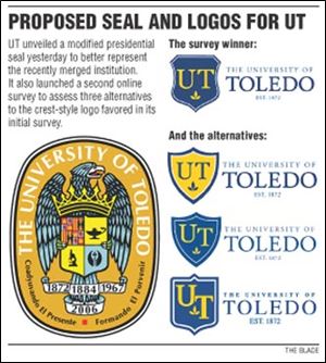
The eagle on the University of Toledo's presidential seal will grip a new shield that displays a microscope, an oil lamp, and the emblem of the Medical University of Ohio, which merged with UT on July 1.
"A new institution was created by an act of law," said Dr. Lloyd Jacobs, UT's president. "It's important to note that change through our iconography."
Before students return for the fall semester, UT has tried to symbolize its postmerger values through an updated seal and new logo possibilities, which were further modified yesterday in response to feedback from a recent online survey.
The updated seal pushes the coat of arms belonging to King Ferdinand and Queen Isabella of Spain, who sponsored Christopher Columbus' 1492 voyage across the Atlantic Ocean, to the upper left hand corner from the shield's center. Split into quarters, the shield has a microscope to represent the value of discovery and an oil lamp, which stands for enlightenment and wisdom. Preserved in the new shield is the MUO emblem, a serpent wrapped around the staff of Aesculapius, the demigod of medicine in Greek mythology.
Dr. Jacobs, who was formerly president of MUO, said the emblem helps combine the legacy of that institution with the heritage of UT.
A banner with the year of the merger, 2006, rests beneath the eagle's tail.
It joins three other years featured on the seal: 1872, when the Toledo University of Arts and Trades was founded; 1884, when the city of Toledo took over UT; and 1967, when it became a state institution.
UT kept the orange, red, yellow, and gray from the earlier seal, first designed in 1931. The Spanish motto remains unchanged, "Coadyuvando el presente, formando el porvenir" (Guide to the present, molder of the future).
Unlike the candidates for the blue and gold logo, which will likely grace business cards and coffee mugs, the seal is more formal.
"It's used for official documents and anything that would come out of the president's office with his mark on it," said John Adams, director of university marketing. "It's more of a restricted use, as most university seals are."
The updated seal came from three to four weeks of collaboration by an internal design team and discussions with Dr. Jacobs.
Meanwhile, the new UT logo continues to evolve following the results of the survey this week.
Respondents favored embedding the UT initials in a crest, but some were lukewarm on the proposed crest's triangular curves.
"One person was talking about a crest that was similar to the crest being used in the actual seal," Mr. Adams said. "We took the opportunity to incorporate that."
Using a combination of earlier designs and new ideas, the university's graphic design staff created three alternatives to the original crest-style logo.
Members of the UT community can vote on these alternatives in a new online survey that will run through Tuesday.
One of the new offerings inverts the blue and gold colors of the earlier design.
Another has more of a diamond-shaped crest.
And the third places the initials on the same raised-point shield used in the seal.
Contact Joshua Boak at:
jboak@theblade.com
or 419-724-6728.